Fall Style Guide: Textures, Intentional Outfits, and Touches of Gold
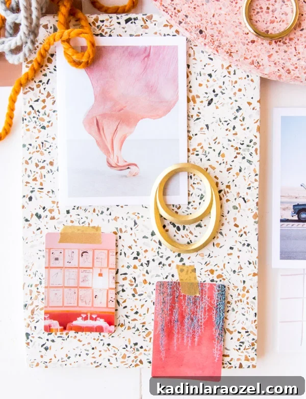
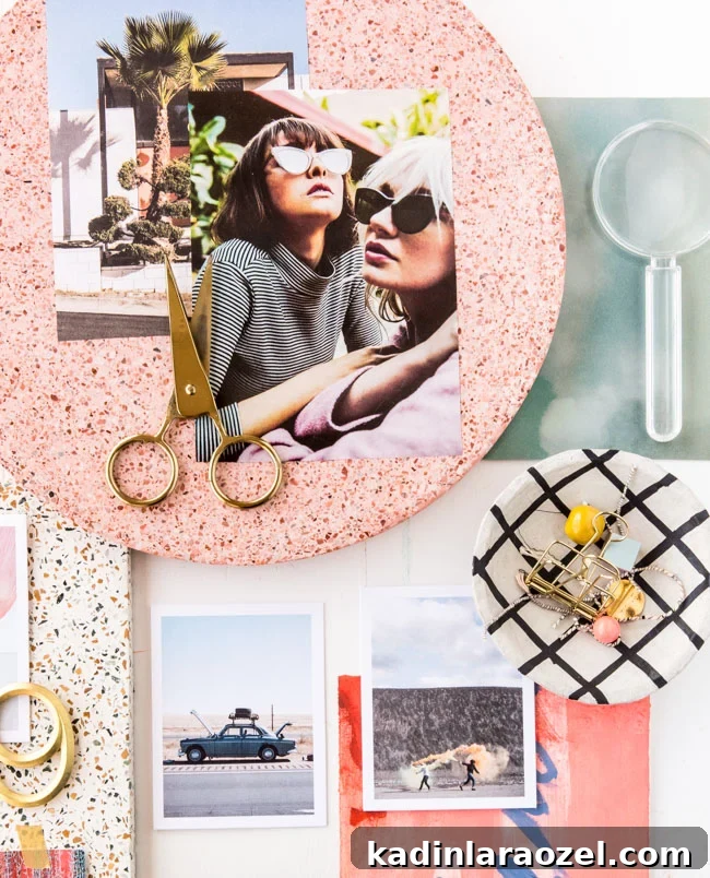
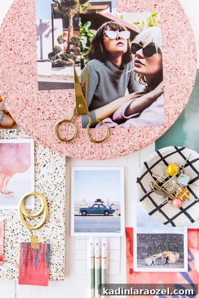
I’m always drawn to intriguing patterns and tactile surfaces in design. It’s no surprise, then, that those elements are central to my new fall style guide — along with touches of gold, calm neutrals, and a few unexpected accents (yes, including that clear magnifying glass).
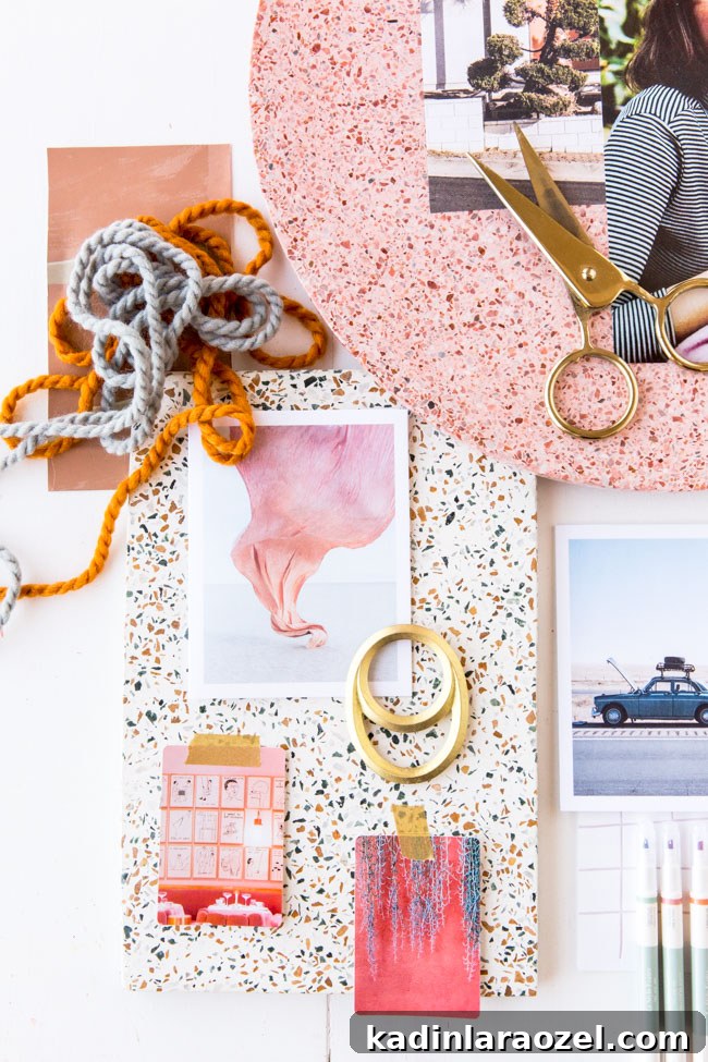
While Jeff and I were in London, I discovered so many inspiring pieces. I’m thinking of the terrazzo cutting boards I can’t get enough of. I wanted to bring some of those discoveries into this season’s guide.
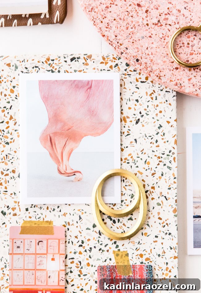
For this edit I stepped away from my usual image-heavy approach and focused more on textures and three-dimensional objects. I pared things back so the visual story feels crisp, intentional, and as refreshing as cooler weather.
The images I included now carry personal meaning beyond being simply pretty. For instance, a large photograph of two girls standing very close together reminds me to collaborate rather than compete. A postcard showing a broken-down car — a Kinfolk card I picked up in Florida — reminds me that plans often change, and that’s okay. And a shot of fabric caught in the wind encourages me to let life carry me sometimes.
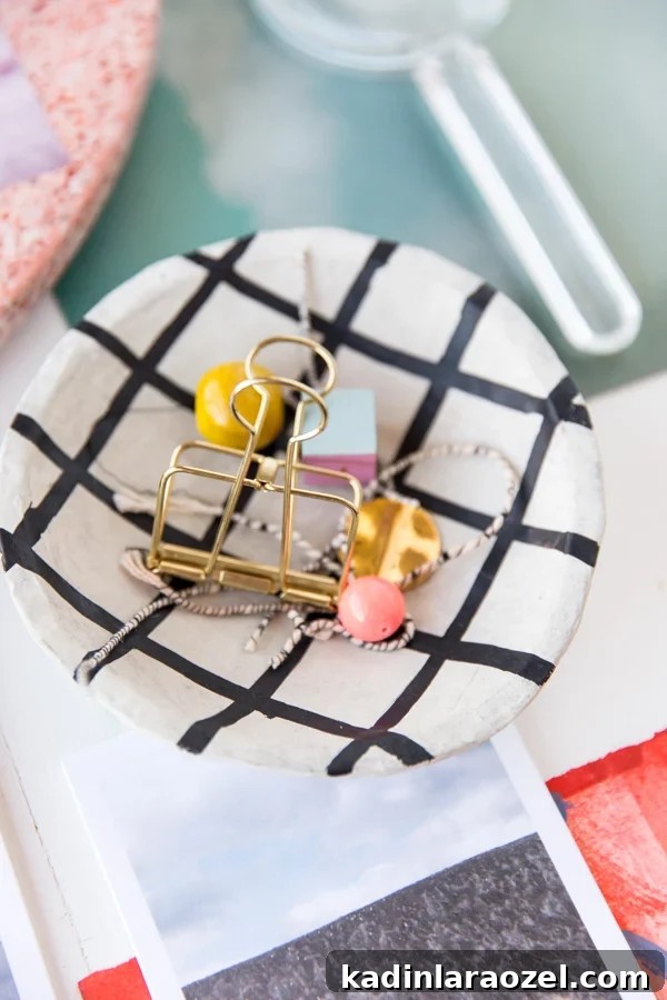
That’s the gist of this month’s style guide: textures, thoughtful objects, and a pared-back palette elevated by small, unexpected details. What’s inspiring you this season? If you had a mantra for fall, what would it be?